
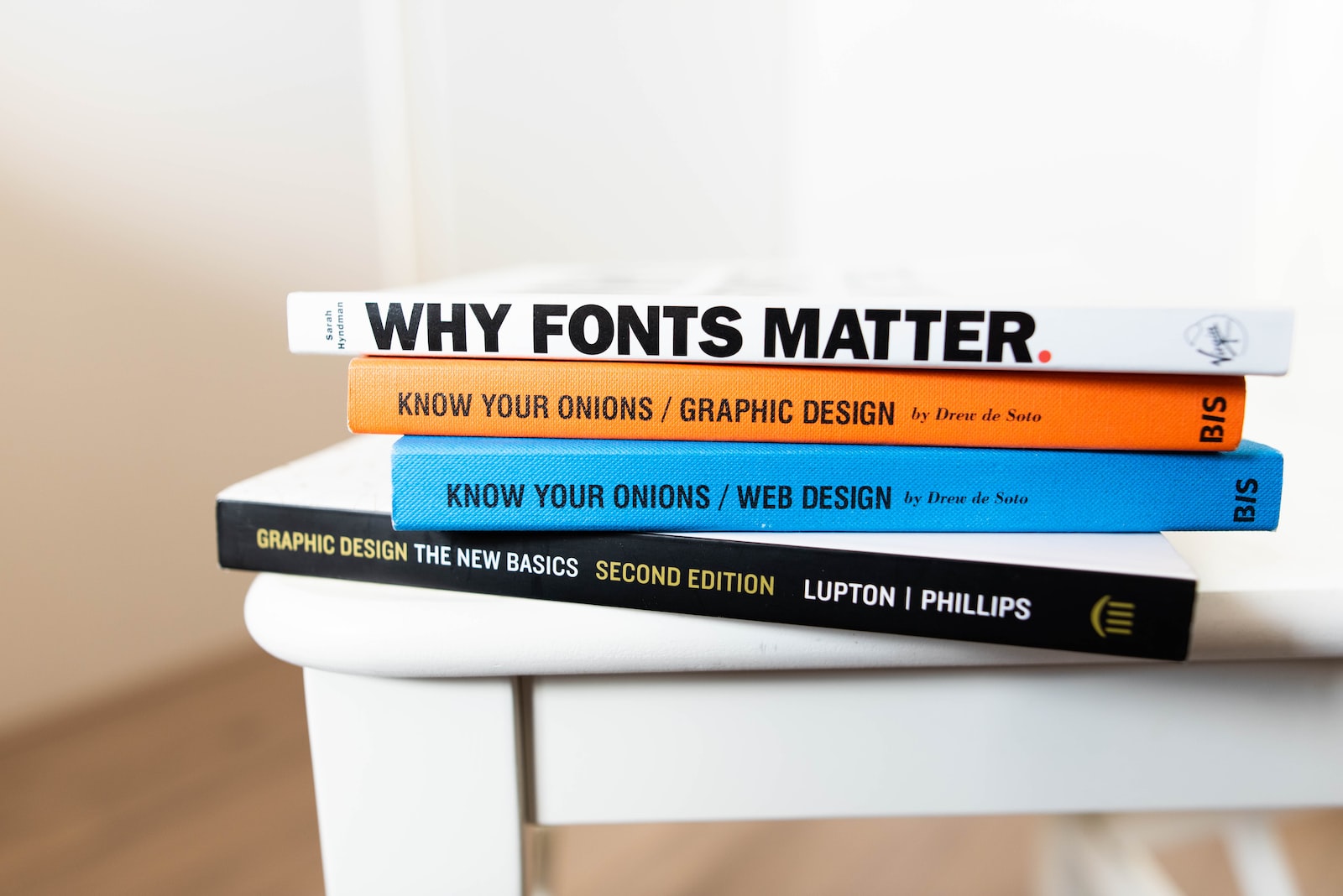
There are many different things to consider when creating an email marketing campaign, but one of the most important is the font you use. The right font can make your emails more readable and engaging, while the wrong font can make them look unprofessional and difficult to read.
Also, when it comes to email marketing, the question of which font is best can be a difficult one to answer. There are a variety of factors that come into play when determining which font will work best for your email marketing campaign.
In this article, we will take a look at some of the most important factors to consider when choosing a font for your email marketing campaign.
What are email-safe fonts?
Email-safe fonts are fonts that can be displayed on any email client without causing any issues with the way the email looks. Some of the most common email-safe fonts include Arial, Tahoma, Verdana, and Times New Roman.
With the use of the right email font, your email will stand out from the rest. Using the wrong email font can make it look unprofessional and even unappealing. There are different types of fonts that you can use for your email. You have to choose the right one so that you will be able to communicate your message properly.
Benefits of using an email-safe font
One of the benefits of using the right email font is that you will be able to make your email look more professional. If you are using the wrong email font, your email will not look as professional as it should be. This is because your message will be badly conveyed.
Another benefit of using the right email font is that you will be able to make your email look more attractive. If you are using the wrong email font, your email will look dull and unappealing. This is because the wrong email font can make it look unprofessional. If you are using the right email font, you will be able to make your email look more attractive. This is because the right email font can make it look more professional.
Another benefit of using the right email font is that you will be able to make your email look more readable. If you are using the wrong email font, your email will look unreadable. This is because the wrong email font can make it look unprofessional.
The last benefit of using the right email font is that you will be able to make your email look more responsive. If you are using the wrong email font, your email will not be as responsive as it should be. This is because the wrong email font can make it look unprofessional. If you are using the right email font, you will be able to make your email look more responsive.
Popular fonts for email marketing
When choosing a font for your email marketing campaign, there are a few things to keep in mind. First, you want to choose a font that is easy to read.
You want to choose a font that is appropriate for the type of email you are sending. If you are sending a promotional email, you will want to choose a font that is flashy and attention-grabbing. If you are sending a more serious email, you will want to choose a font that is more subdued.
Arial
This is the most popular font for emails and it is also the default font for some email clients. Arial is a sans-serif font that is easy to read on a screen. It is also a large font, so it is easy to read on a screen. Arial is a popular choice for email marketing because it is compatible with most email programs.
Courier New
This is another popular font for email marketing. It is a monospaced font which means that each character takes up the same amount of space. This can be helpful for making sure that your email looks the same on different devices.
Helvetica
Helvetica is a sans-serif font which means that it does not have the small lines at the end of each character. This makes it a good choice for emails as it can be easier to read on screen.
Times New Roman
Times New Roman is a serif font which means that it has the small lines at the end of each character. This can be helpful for making your email look more formal.
Verdana
Verdana is a sans-serif font which was designed specifically for screens. This makes it a good choice for emails as it can be easier to read on screen.
Georgia
Georgia is a serif font that was designed specifically for screens. This can be helpful for making your email look more formal.
Most attractive fonts to customers
Here are some of the most attractive email marketing fonts to consider for your next campaign:
1. Helvetica
Helvetica is a clean, classic sans-serif font that is easy to read on any screen. It’s versatile and can be used for a variety of purposes, from body copy to headlines.
2. Arial
Arial is another sans-serif font that is popular in email marketing. It’s similar to Helvetica but has a slightly softer feel.
3. Verdana
Verdana is a sans-serif font that was designed specifically for screens. It’s easy to read on a variety of devices and has a neutral tone that makes it ideal for a wide range of email marketing campaigns.
4. Georgia
Georgia is a serif font that is classic and sophisticated. It’s ideal for emails that require a more formal tone, such as invitations or announcements.
5. Times New Roman
Times New Roman is a serif font that is associated with news and print media. It’s a good choice for emails that need to convey a sense of urgency or importance.
6. Comic Sans
Comic Sans is a fun, casual font that can add personality to your email marketing campaigns. It’s best used in small doses, such as for headlines or call-to-action buttons.
7. Trebuchet
Trebuchet is a sans-serif font that is easy to read on screens. It’s a good choice for emails that are heavy on text, such as newsletters or blog posts.
8. Courier
Courier is a monospaced font that is often used for code or other technical text. It’s a good choice for emails that need to convey a sense of precision or accuracy.
9. Lucida
Lucida is a sans-serif font that is easy to read on screens. It’s a good choice for emails that are heavy on text, such as newsletters or blog posts.
10. Tahoma
Tahoma is a sans-serif font that is easy to read on a variety of devices. It’s a good choice for emails that need to be accessible to a wide range of readers.
Which one is the most professional email marketing font to use when sending emails to customers?
This depends on the brand, the target audience, and the overall tone of the email marketing campaign. However, some fonts are generally considered to be more professional and attractive to customers than others. These include sans-serif fonts such as Arial, Helvetica, and Verdana, as well as serif fonts such as Times New Roman and Georgia.
how do you know which one is right for your brand?
Here are a few tips to help you choose the perfect font for your next email campaign:
1. Keep it simple
When it comes to email marketing, less is more. Use a simple font that is easy to read and won’t distract from your message.
2. Avoid fancy fonts
Fancy fonts may look nice, but they can be hard to read and may not display correctly on all devices. Stick with a simple, clean font for the best results.
3. Consider your audience
Think about who your email is going to and choose a font that appeals to them. For example, a more formal font may be better for business customers, while a playful font could be better for consumers.
4. Test, test, test
Before you send your email, test it out on different devices to make sure the font looks good and is easy to read. You may also want to test different fonts to see which one gets the best response from your audience.
Professional email vs sales email on typefaces
When it comes to email, there is a big difference between professional emails and sales emails. Professional emails are usually sent between coworkers, clients, or other business associates. They are usually concise and to the point, and often include attachments or links to documents or files.
Sales emails, on the other hand, are sent to potential customers in an attempt to sell a product or service. Sales emails can be much longer and often include special offers or discounts.
Professional email doesn’t necessarily have to be salesy but sales emails have to be professional. Sales emails should be professional in order to create a good impression with potential customers. While professional emails don’t have to be salesy, they should still be well-written and free of any errors.
Readability is the ultimate
In email marketing, the success of the campaign is not just measured in the number of clicks or how many people read your emails. It is also measured by whether or not the recipients take the desired action.
This means that the email should be easy to understand, make the recipient want to take the desired action, and be able to be completed quickly.
In general, the best way to achieve this is to keep the email as short as possible. The goal is to get the message across without overwhelming the reader.
It is also important to use simple language and to avoid technical jargon. The email should be easy to scan so that the reader can quickly find the information they are looking for.
Finally, it is important to include a call to action that is clear and concise. The goal is to make it easy for the reader to take the desired action.
How to improve email readability
Email readability can be improved in a number of ways, including:
1. Use a clear and concise subject line
First and foremost, make sure your email has a clear and concise subject line. A good subject line will let the recipient know what the email is about and why they should read it.
2. Keep the body of the email short and to the point
The body of your email should be short and to the point. Get straight to the point and avoid lengthy paragraphs.
3. Use bullet points
If you have a lot of information to include in your email, consider using bullet points. Bullet points make information easier to scan and can help improve email readability.
4. Use simple language
When writing your email, use simple language that can be understood by everyone. Avoid using jargon or technical terms that not everyone will be familiar with.
5. Use a readable font
When choosing a font for your email, make sure it is easy to read. Some fonts are more difficult to read than others, so choose wisely.
6. Avoid using all caps
Using all caps in your email can be difficult to read and can come across as shouting. Avoid using all caps whenever possible.
7. Use proper grammar and punctuation
Make sure your email is free of grammar and punctuation errors. Poor grammar and punctuation can make your email difficult to read and can give the impression that you are not professional.
Conclusion
When you are using the right email font, you will be able to make your email look more attractive. This is because the right email font can make it look more professional. If you are using the wrong email font, you will not be able to make your email look more attractive.


